
Rock Forms & Composition

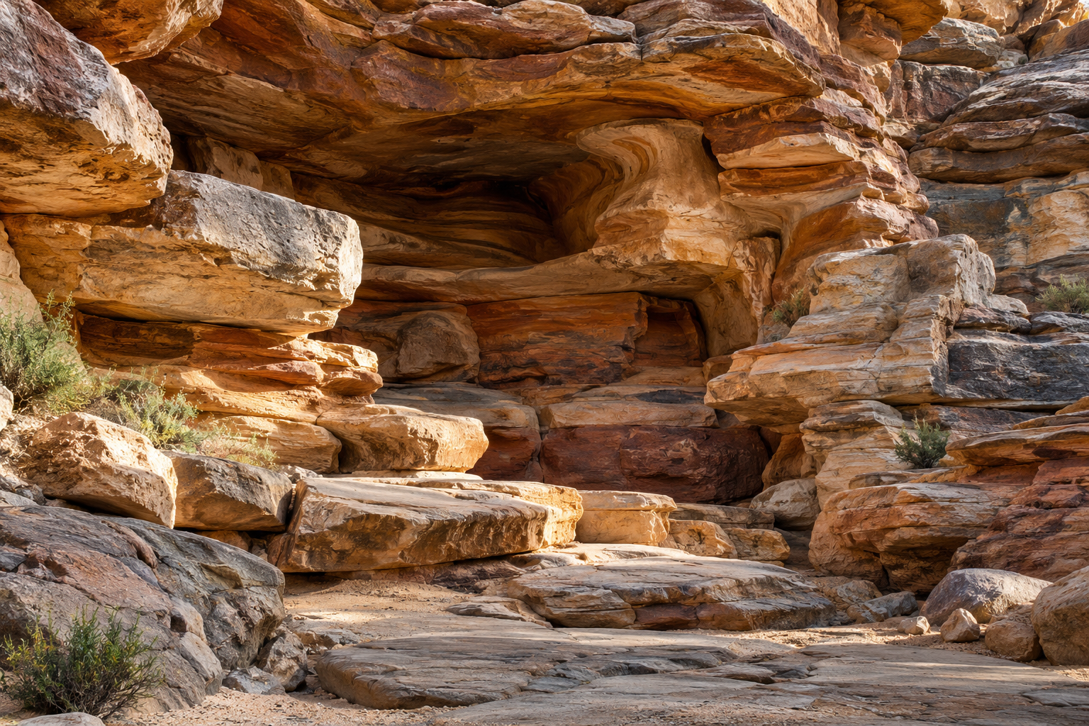
Illustration of layered sandstone forms surrounding a grotto recess

Believable rockwork begins with large shapes. Before a surface receives cracks, stains, or fine texture, its masses must establish a recognizable relationship: layers continue, blocks overlap, and openings feel connected to the surrounding stone. Rock Forms & Composition concentrates on that visual structure. Explore the balance between dominant masses and smaller accents, the direction of bedding, the use of shadow, and the way an entrance interrupts a rock face. Natural references offer more than surface patterns. They reveal families of shapes produced by particular geological histories, giving designers alternatives to an undifferentiated pile of rounded bumps. This collection is for scenic artists, landscape designers, model makers, and readers who want to understand why some artificial rock feels coherent. Examine silhouettes from a distance, then move closer to the seams and transitions that sustain the illusion. A convincing composition can include variation without abandoning order. Its success depends on the relationship among parts, the viewpoints from which they are seen, and the deliberate choice of details that support the larger form instead of competing with it.

Massing: Establish the largest volumes before surface decoration.
Silhouette: The outer outline remains visible when detail disappears.
Bedding: Layer direction can organize an entire rock face.
Fracture family: Related breaks create more coherence than random scratches.
Hierarchy: Dominant forms need quieter supporting shapes.
Overlap: Foreground masses can establish depth.
Negative space: Openings are part of the composition.
Scale: Texture size must relate to the overall rock mass.
Transition: Adjacent pieces should meet intentionally.
Viewpoint: Composition changes with the observer's position.
Broad planes: Large quiet surfaces make smaller details readable.
Layer continuity: Interrupted bedding can expose an artificial assembly.
Asymmetric balance: Unequal masses can still create a stable visual arrangement.
Entrance emphasis: An opening can act as the focal shape.
Shadow pockets: Recesses add depth without requiring added color.
Edge variation: Sharp and weathered boundaries communicate different histories.
Repeated molds: Obvious duplicates weaken naturalistic variety.
Ground contact: The base helps a rock mass feel embedded.
Distant reading: Fine texture cannot rescue an unconvincing silhouette.
Material unity: Color should support rather than replace form.
Geological photographs: Choose references with known rock character.
Silhouette sketches: Reduce the composition to its major boundaries.
Clay studies: Test masses before committing to fine surfaces.
Section models: Examine overhangs and recess depth.
Texture boards: Compare scales and directions of detail.
Raking-light tests: Reveal relief on a sample surface.
Viewpoint markers: Evaluate the same positions throughout development.
Grayscale studies: Separate tonal hierarchy from color preference.
Pattern maps: Track bedding across panel boundaries.
Mockup photographs: Review the assembly from its intended distance.
Geological logic: Consistent references provide rules for variation.
Detail economy: Selective texture can feel more natural than uniform busyness.
Seam camouflage: A joint works best where the composition already permits a break.
Depth layering: Foreground, middle, and background masses create spatial order.
Scale transfer: A small rock texture enlarged indiscriminately may lose plausibility.
Weathering intent: Surface wear should relate to exposure and water paths.
Opening integration: The cave mouth should belong to the rock mass around it.
Lighting dependence: Shadows can strengthen or undermine the intended form.
Ground relationship: Nearby grade and planting affect perceived weight.
Review sequence: Resolve silhouette, massing, and joints before polishing texture.
Blank rock: Natural faces can contain surprisingly quiet areas.
Repeated direction: A few aligned layers can unify many separate pieces.
Shadow geometry: Dark gaps can read as substantial depth.
Small accents: One fractured edge can suggest a larger geological story.
Embedded forms: Partial burial can change a boulder's apparent weight.
Moving silhouettes: The same mass reads differently around a corner.
Scale tricks: Tiny textures can make large rockwork appear miniature.
Water traces: A localized stain can imply a path across the surface.
Broken symmetry: Balanced composition need not mirror itself.
Unfinished models: Rough studies often reveal problems more clearly than polished renderings.
Q: Should texture come before massing?
A: No. Large forms establish the composition that texture supports.
Q: Why do random bumps look artificial?
A: They may lack the directional relationships found in a coherent geological reference.
Q: Can repeated molds look natural?
A: Yes, if placement, orientation, and surrounding transitions avoid obvious duplication.
Q: What is negative space in rockwork?
A: It is the shape of openings and gaps between masses.
Q: Does realistic color guarantee convincing rock?
A: No. Silhouette, scale, layering, and joints also matter.
Q: How can panel seams be concealed?
A: Integrate them with deliberate breaks while preserving necessary functional joints.
Q: Why photograph a mockup from farther away?
A: The intended viewing distance changes which details dominate.
Q: Can different rock types be combined?
A: They can, but their relationship should be intentional.
Q: What should be reviewed first?
A: Start with the overall outline and major masses.
Q: How much surface detail is enough?
A: Enough to support the geological character without obscuring the larger forms.